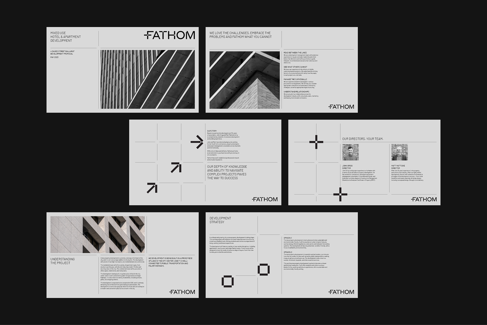
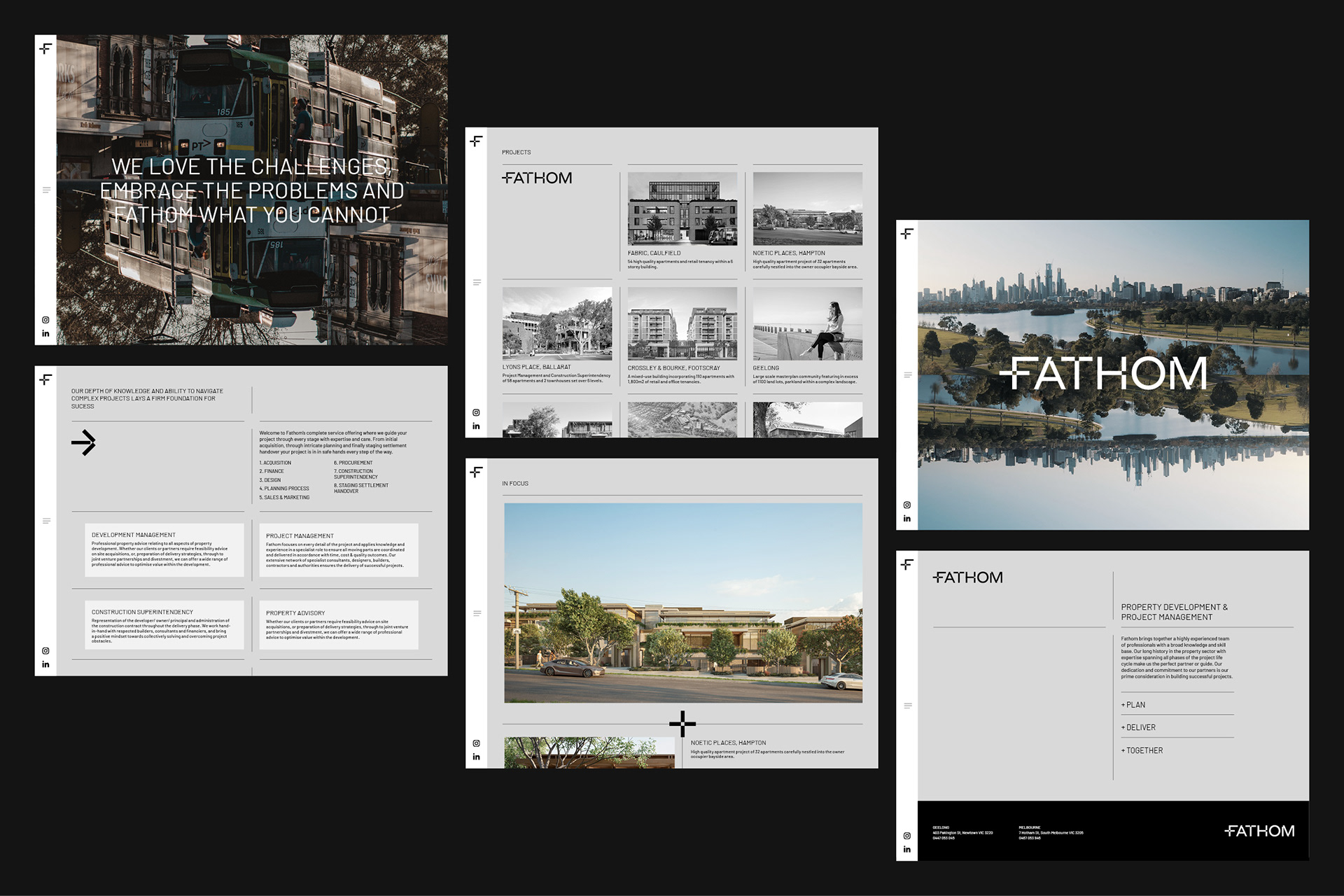
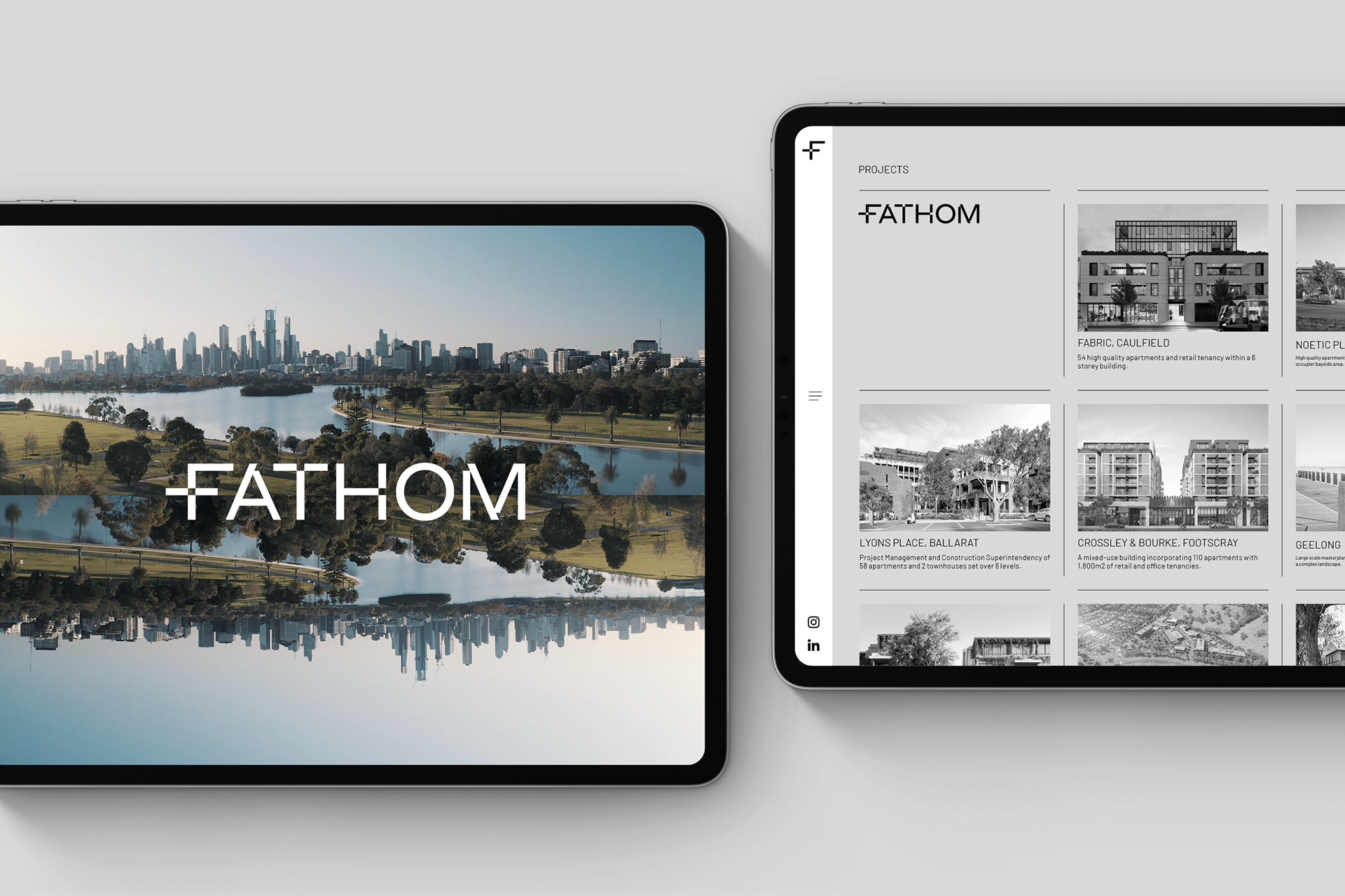
With a team composed of highly experienced professionals and offering a complete service, Fathom guides a project through every stage with expertise and care, from initial acquisition through intricate planning and finally staging settlement handover.
This intrinsic depth of knowledge and ability to navigate complex projects belonging to Fathom guided the concept design, leading the name choice to Fathom – which means to deeply understand a complex problem after much thought – and a brand identity that values and enhances this ability.
BRIEF
Formerly Vorhaben, the Fathom Group is a project and development manager who sought a new brand identity and name for the business. Visuals and naming should be relevant to their work, and, more importantly, the name should be easy to pronounce.
SOLUTION
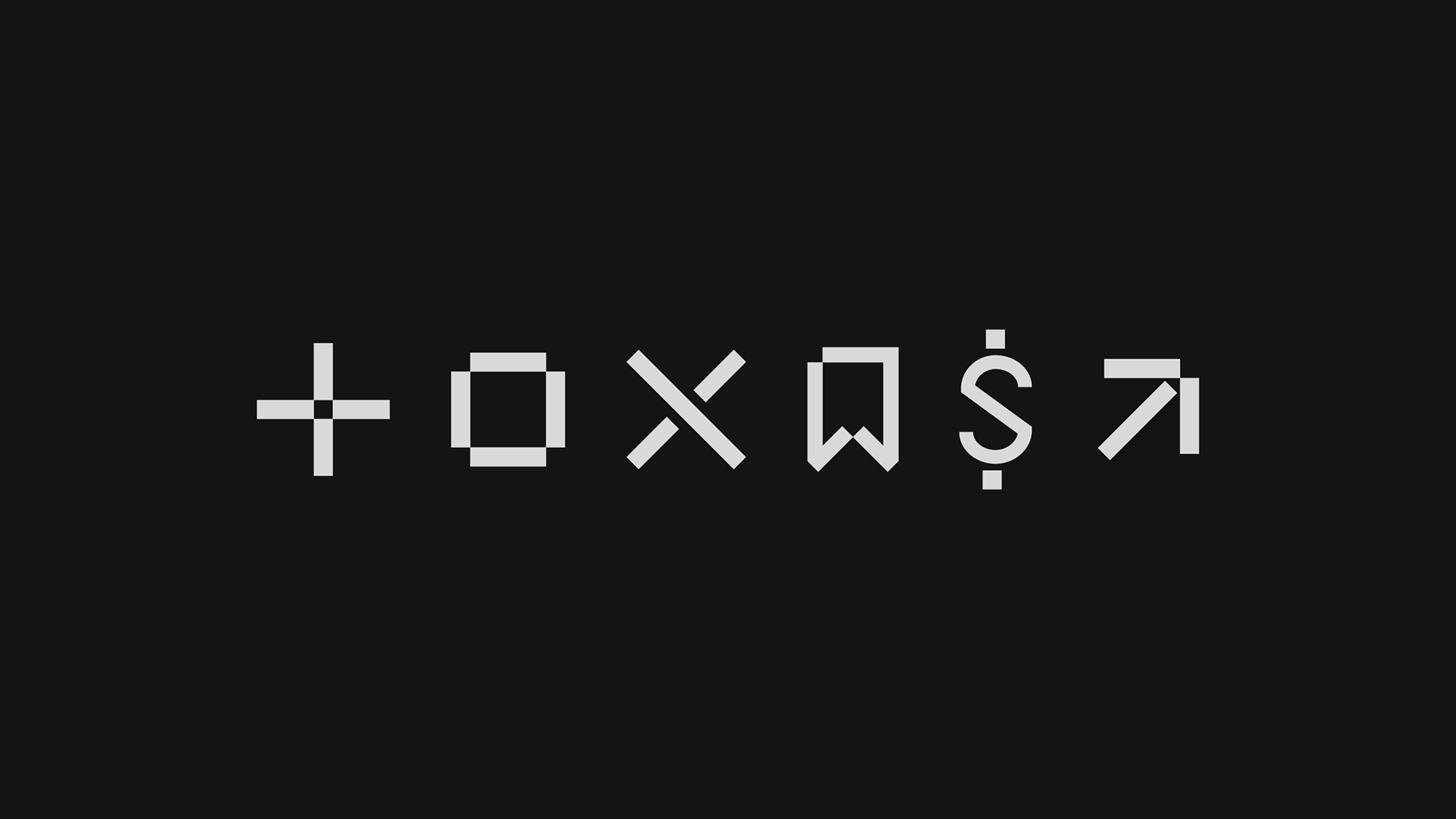
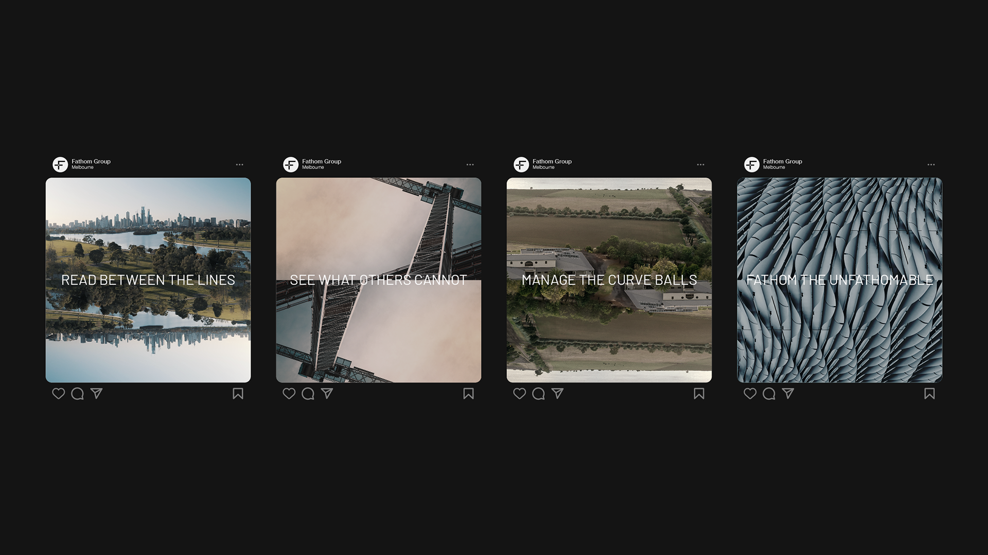
With thinking centred around the teams' ability to navigate clients through tricky or unfamiliar territory, seeing solutions in situations others couldn't see, the outcome features a solid brand identity, highlighting their adeptness at understanding and solving problems.
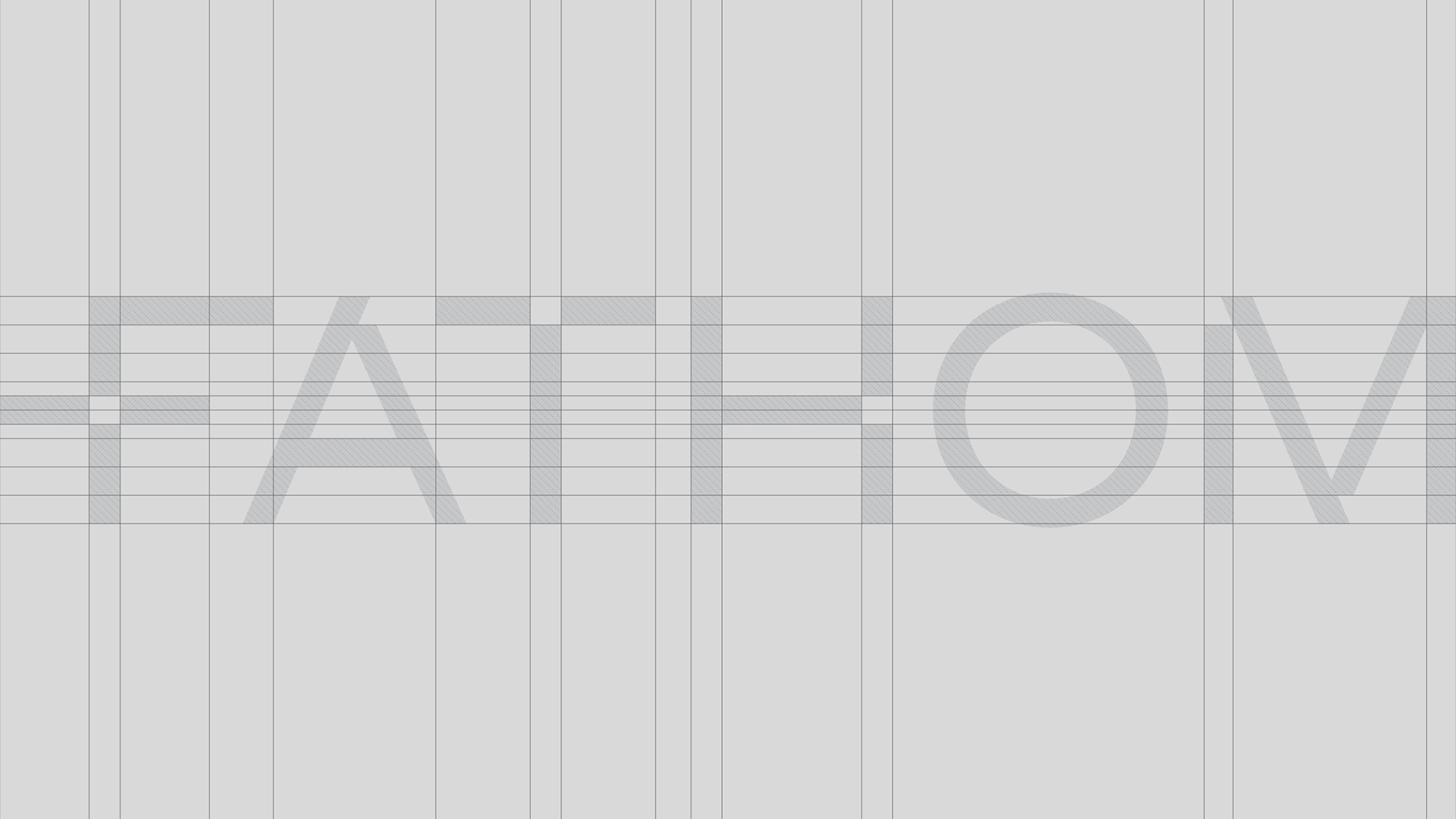
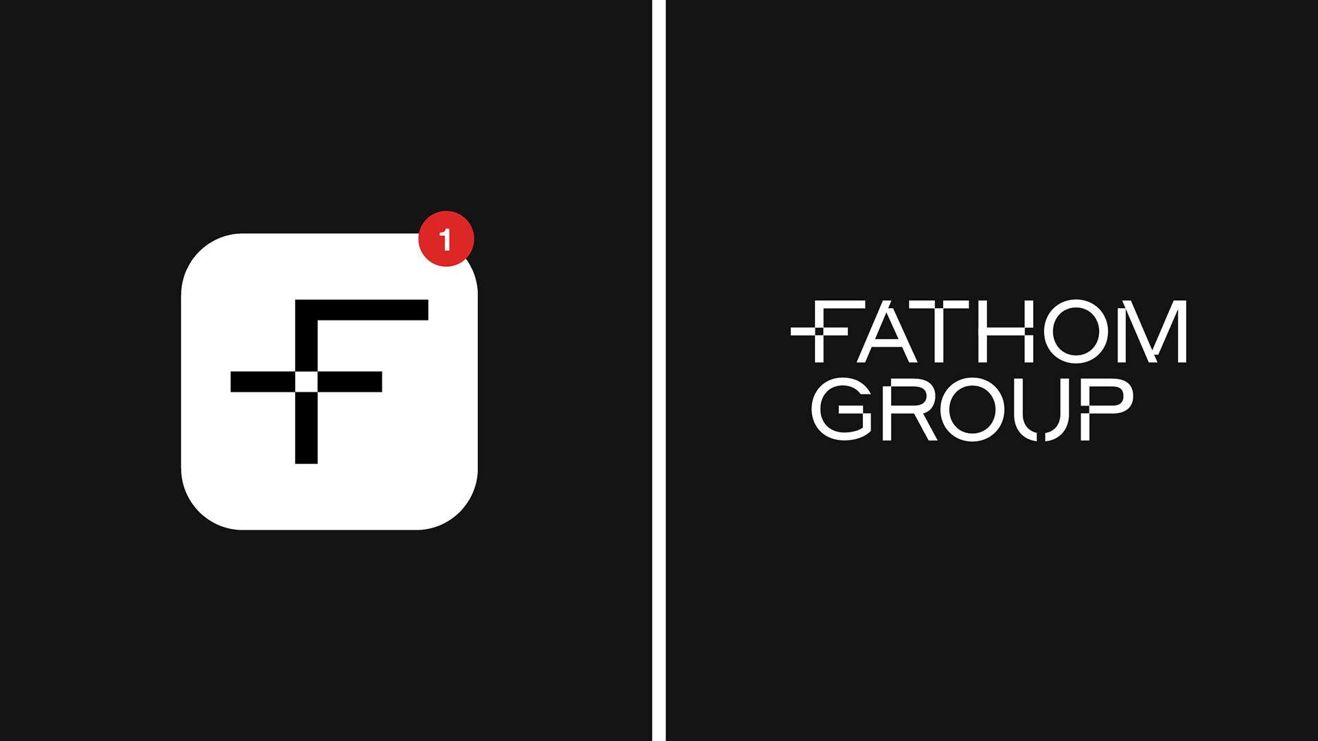
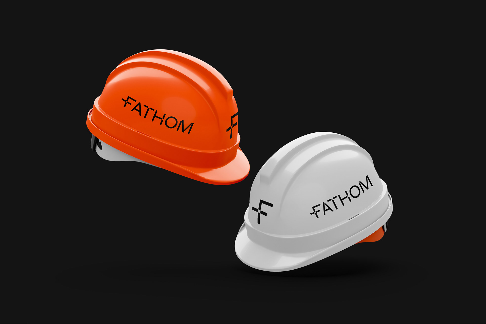
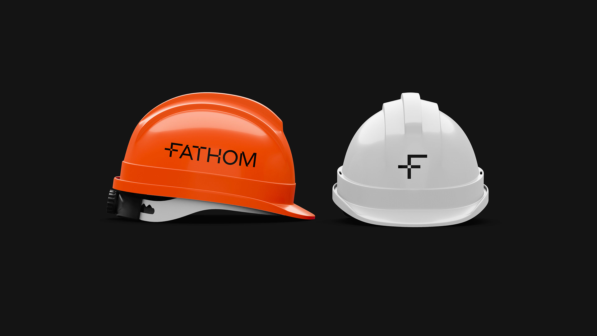
This ability to navigate complex projects is further valued and enhanced by the logotype geometric form based on a grid and the bold typography, which explores the importance of setting solid foundations in projects. This set of visual design elements speaks directly to the audience, conveying more clarity and certainty about what can be expected from the Fathom Group.


Client — Fathom Group
Brand Identity — Ology Creative
Creative Direction — Natalie Sparkman
Design – Natalie Sparkman, Emily Bush, Rodney Bacelar
Motion Graphics — Rodney Bacelar
Web Design – Emily Bush, Rodney Bacelar