BRIEF
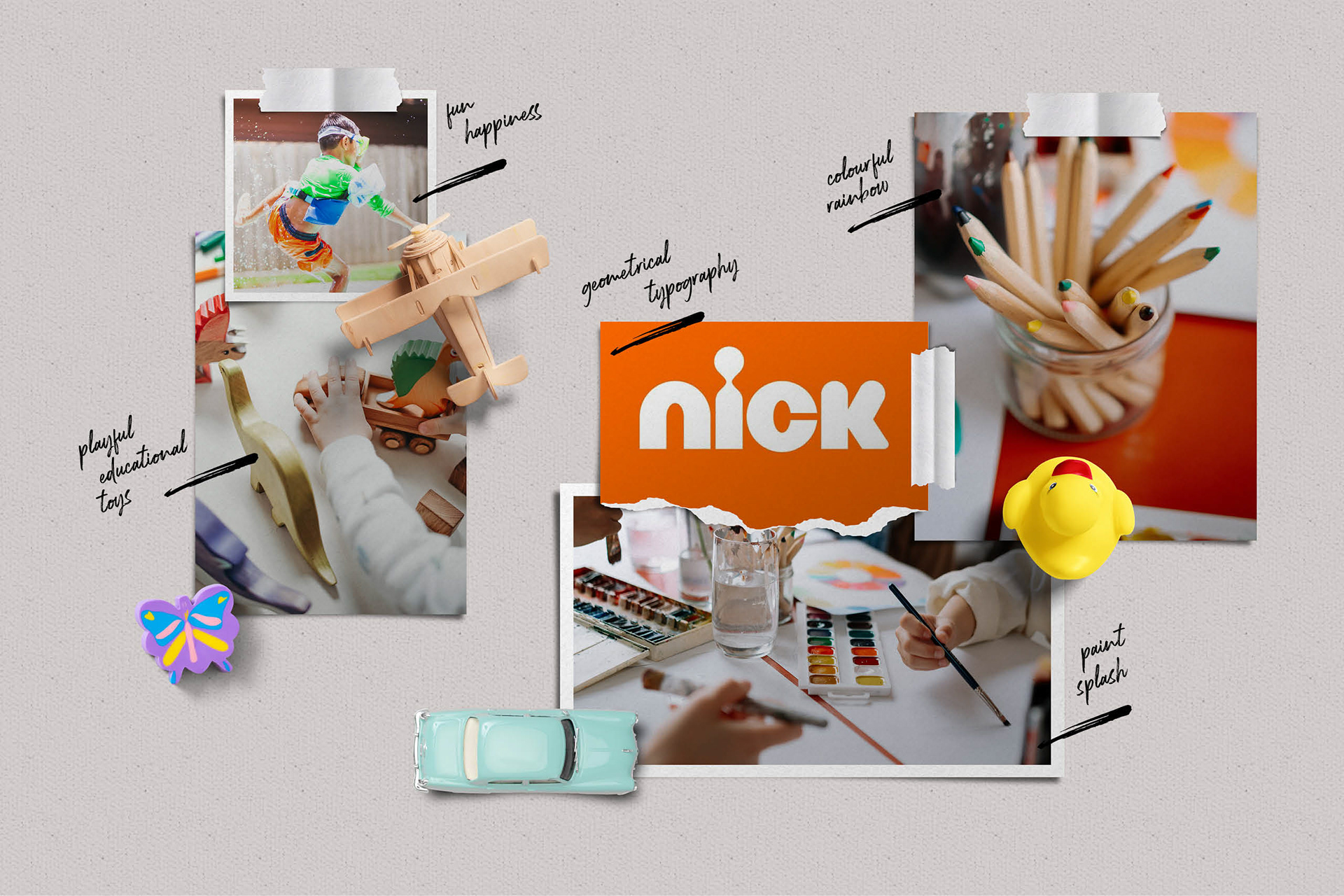
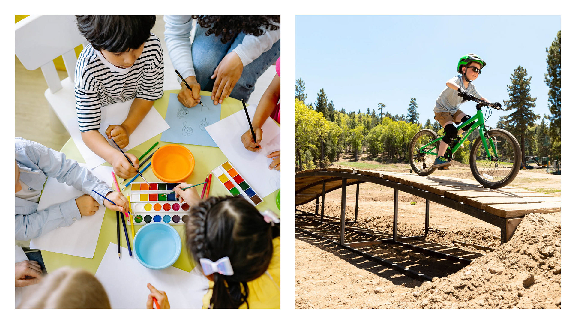
Creating a brand for a toy store that is both modern and friendly while also conveying a sense of lightness was a challenging task. To tackle this task, a moodboard was created to identify elements from the children's universe that could be used to establish a coherent aesthetic for the brand. The mood board included images, colours, and shapes that could inspire the creation of a brand that resonates well with its target audience.
The moodboard also helped create a colour palette that effectively communicates the brand's visual identity. The colour palette was chosen carefully to ensure that it can display the brand's values and message clearly and concisely. Additionally, typography and design elements were selected to complement the mood board and the brand's identity.
Overall, the process involved extensive research and careful consideration to create a brand that is appealing to children and parents alike. The aim was to create a fun, playful, and visually engaging brand while being professional and credible.
SOLUTION
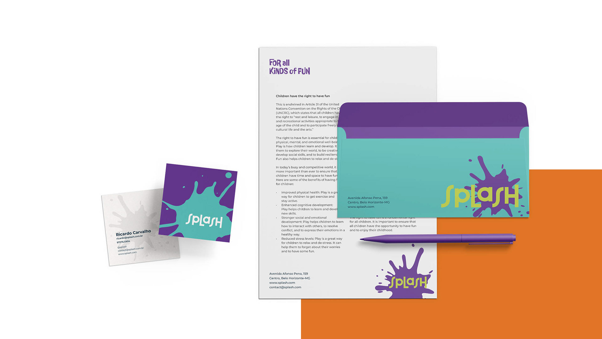
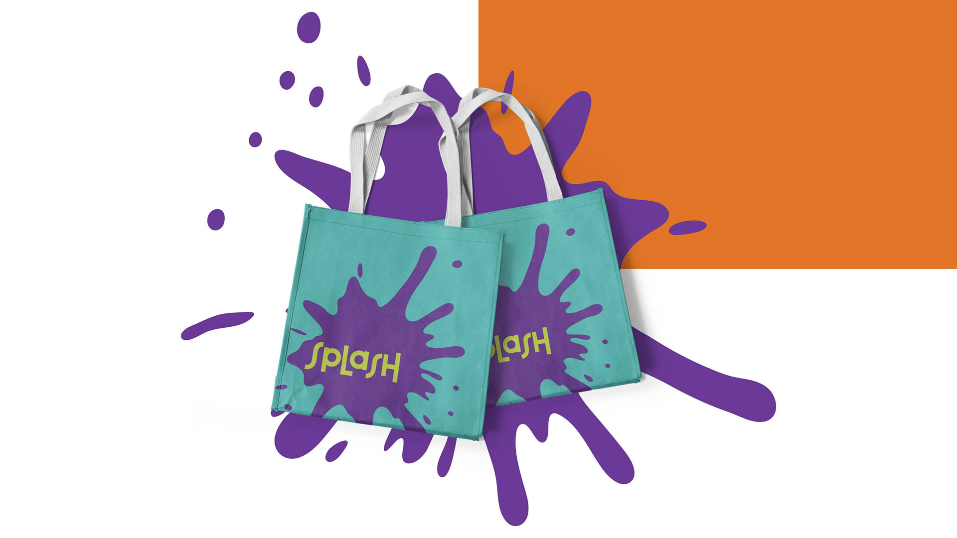
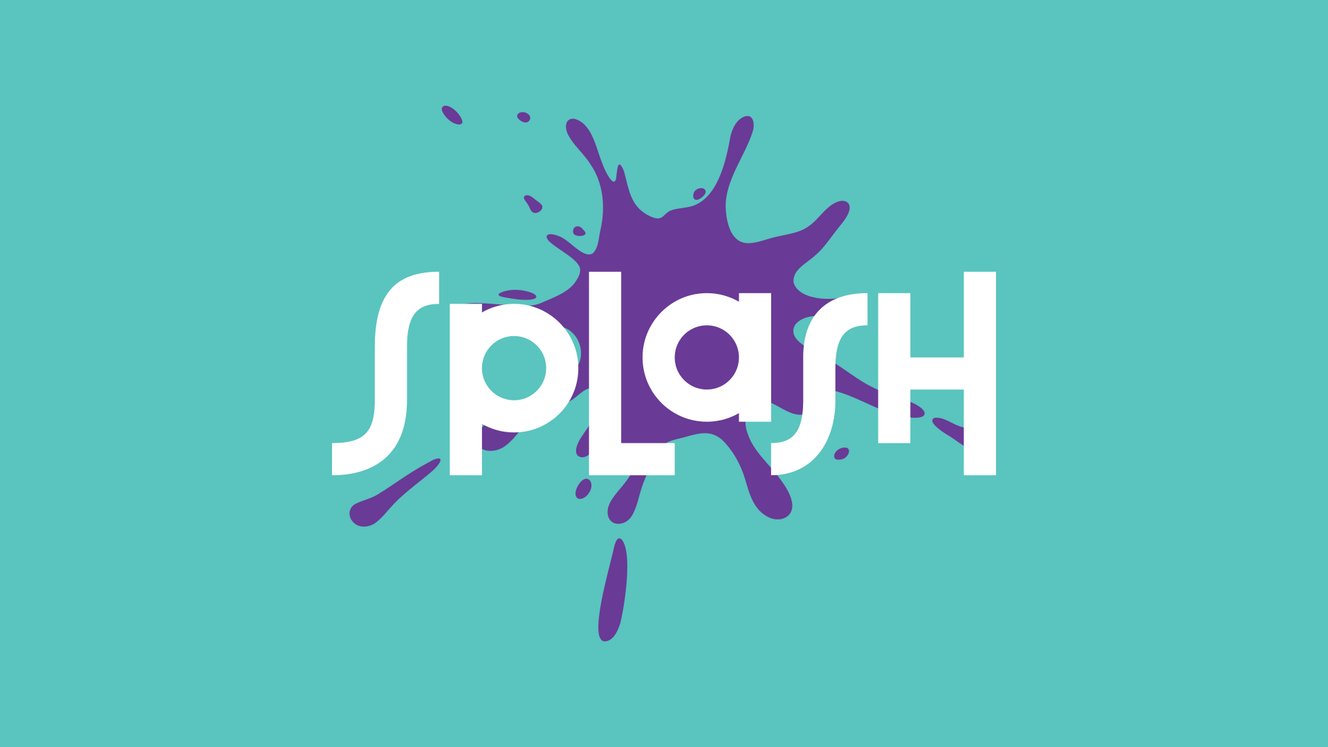
A hybrid proposal that combines strength and fluidity in the same concept
Straight lines and curved lines have unique visual properties that can influence the perception of a brand. Straight lines are often associated with strength, stability, and efficiency. Curved lines, on the other hand, convey a sense of softness, fluidity, and friendliness.
When used together in a brand design, these elements can create a powerful and harmonious composition that appeals to a wide audience. Combining straight and curved lines can help a brand establish a strong foundation while projecting a welcoming and approachable image. This balance is crucial for brands that want to defend the interests of their target audience while also building lasting relationships with them.
Attributes
Friendly | Fun | Proactive | Committed | Strong | Modern
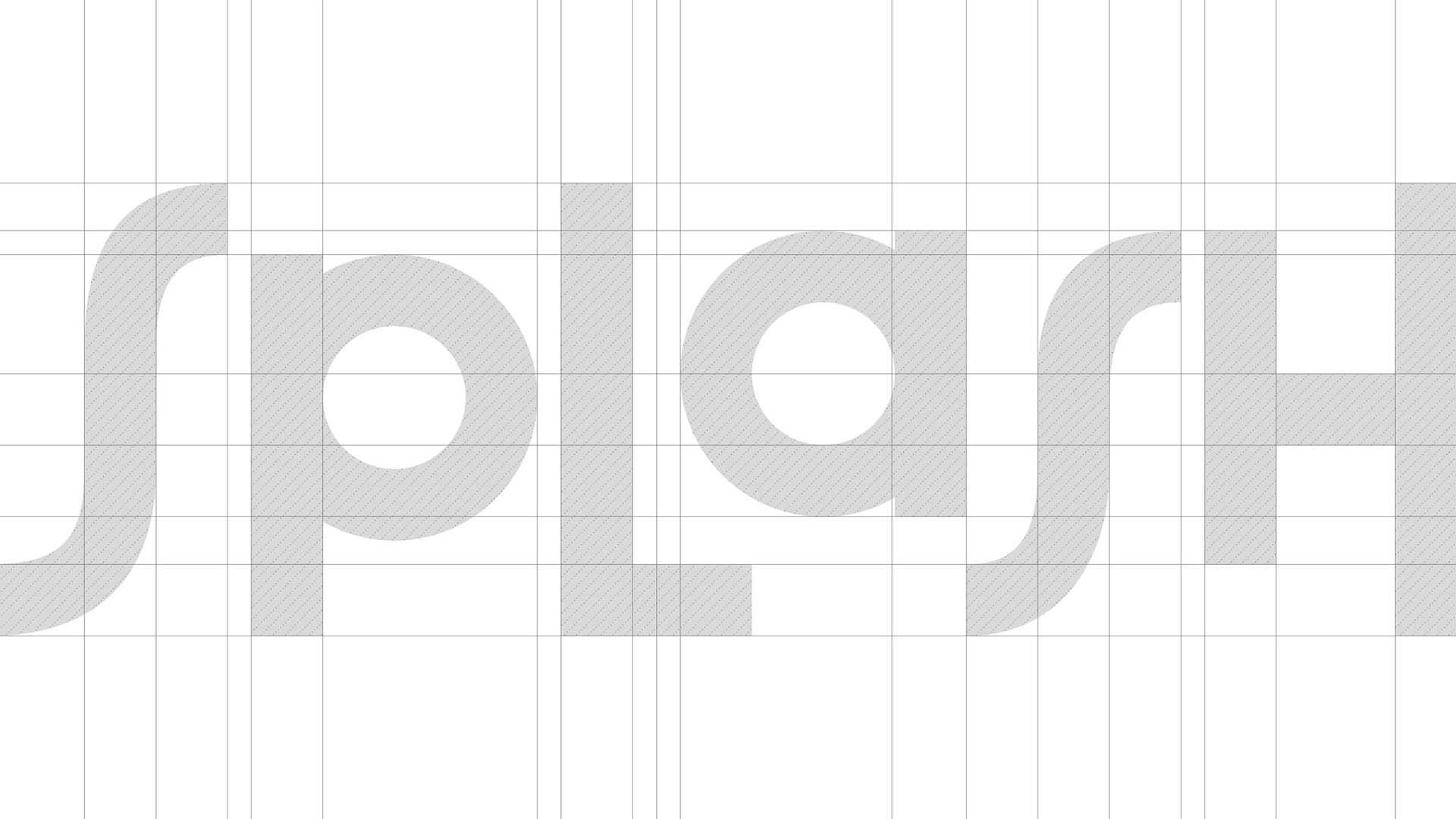

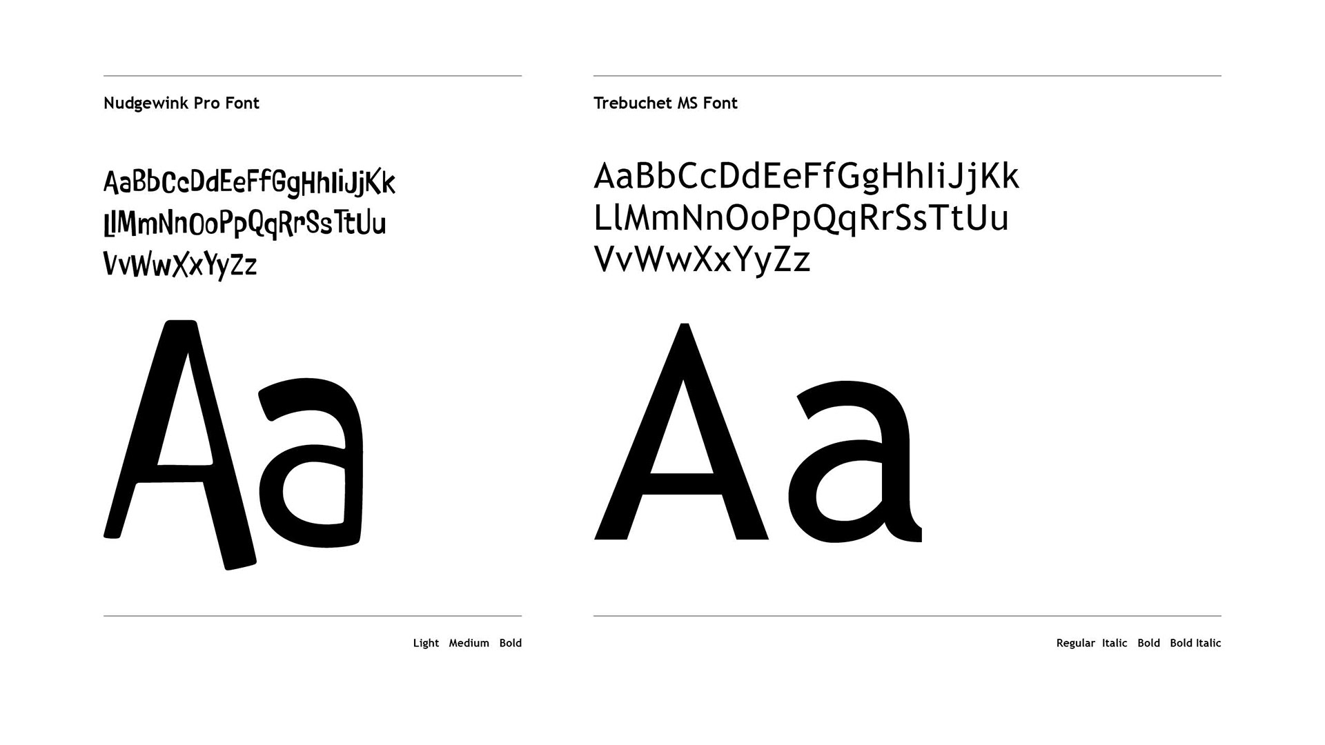
TYPOGRAPHY
When selecting a typographic family, the decision was based on multiple factors. The family's modern features and clear legibility were important considerations. The chosen family also offers an exciting aesthetic with its mix of upper and lower case letters. This combination of features creates a unique and visually appealing experience for the reader, making the text more engaging and memorable. Overall, the typographic family is an excellent choice for enhancing the visual appeal of the text while maintaining its readability.
COLOURS
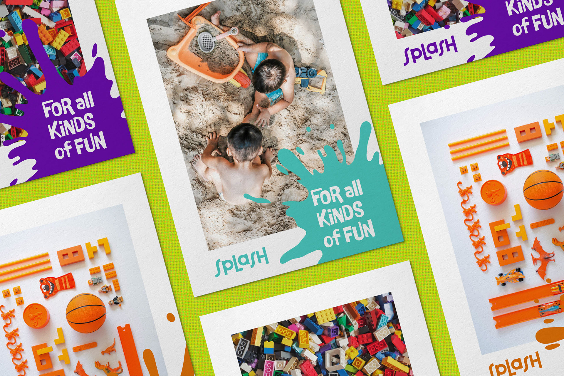
A complete rainbow for the joy of any child
Children are a source of boundless energy and vitality, and their vibrance was encapsulated in the brand's vibrant colour palette.
Composed of five distinct colours, they can be used independently or in harmony with one another to convey different moods and emotions. The colours are versatile and can be used to represent different aspects of the brand, from playfulness and creativity to reliability and trust.